Stickers are small, but they reveal quality problems fast. Soft edges, low contrast, and awkward trimming are easy to miss on a screen and hard to ignore once a die-cut sheet arrives.
This guide is for anyone who needs custom stickers on a short timeline without design experience—event organizers, small brands, classroom projects, internal teams, and gift add-ons. The workflow focuses on decisions that reduce rework at the print-and-cut stage.
Custom die-cut sticker tools tend to differ in a few practical ways: whether they make sizing and safe areas obvious, how they handle vector shapes versus photos, and whether exports match what printers and cutting machines expect.
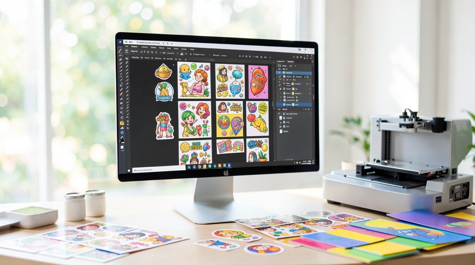
Adobe Express is a helpful starting point because it supports a template-first workflow that can get a clean layout in place quickly, which is often the hardest part for beginners.
Step-by-step how-to guide for using Custom Die Cut Stickers Tool
Step 1: Pick Sticker Size, Cut Style, and a Simple Layout Direction
Goal
Set constraints early so the design fits the sticker format and cuts cleanly.
How to do it
- Decide the sticker’s job: branding label, laptop decal, packaging seal, name tag, or giveaway.
- Choose a size range that matches the use (small labels behave differently than large decals).
- Decide the cut style: simple shape (circle/rectangle) or custom die-cut outline.
- Choose a design approach that matches the cut style (bold icon, short text, simple badge, or photo + label).
- Create a basic draft layout sized for your sticker, and then finish it with this custom sticker maker from Adobe Express.
What to watch for
- Very small text can become unreadable after cutting tolerances and print dot gain.
- Thin outlines can cut poorly or disappear when printed.
- Custom outlines that are too complex can create fragile sticker “spikes.”
Tool notes
- Adobe Express— Useful for getting a clean sticker layout started quickly, especially when you want a template-style structure.
Step 2: Choose a “Cut-Safe” Concept and Limit the Detail
Goal
Keep the sticker readable and physically durable once cut.
How to do it
- Use one focal element (icon, short phrase, or simple badge).
- Keep text to a few words; prefer one strong line over multiple lines.
- Avoid intricate borders; use thicker shapes and simpler silhouettes.
- Leave generous padding around the main element so the cut line has room.
- If using a logo, choose a version designed for small sizes (no tiny taglines).
What to watch for
- Overcrowding makes stickers feel busy and harder to read from a distance.
- Narrow internal gaps can “fill in” visually when printed.
- Highly detailed art may look fine at 100% zoom but degrade at sticker size.
Tool notes
- Notion— Keep a short “sticker spec” page (size, cut style, color notes, version names) so revisions stay consistent.
Step 3: Gather Assets That Won’t Pixelate
Goal
Use images and artwork that stay sharp at print resolution.
How to do it
- Prefer vector assets for logos and icons when possible.
- If using a photo, choose one with strong lighting and clear subject separation.
- Avoid screenshots and small images pulled from thumbnails.
- Keep line art thick enough to hold on paper or vinyl.
- Confirm you have rights to print any logos, photos, or character art.
What to watch for
- Low-resolution images often look acceptable on a phone and fail in print.
- Transparent-background assets sometimes import with jagged edges if they are too small.
- Complex gradients can band or look muddy depending on printing method.
Tool notes
- Google Drive— Store “Originals” and “Exports” in separate folders to avoid uploading a downscaled file.
Step 4: Build in Safe Margins and a Clear Cut Line Plan
Goal
Prevent important details from being trimmed or crowded by the cut.
How to do it
- Keep critical content away from edges with a consistent internal margin.
- Decide whether the sticker should have a border (often helps the cut look intentional).
- If custom die-cut, keep the outline smooth and avoid sharp spikes.
- If the printer uses bleed, extend backgrounds beyond the final cut line.
- Do a zoomed-out check: the design should still read as one shape.
What to watch for
- Borders that are too thin can look uneven if the cut shifts slightly.
- Tight margins make tiny placement changes obvious.
- Internal cutouts and holes can tear more easily on some materials.
Tool notes
- Miro— Drop a screenshot of the design on a board and draw the intended cut line to check spacing quickly.
Step 5: Set Contrast and Color for the Sticker Material
Goal
Make sure the sticker stays readable on the chosen material and finish.
How to do it
- Choose a background and text color pairing with strong contrast.
- Avoid very light colors on clear or glossy materials unless the printer supports white ink.
- Keep color count simple if the job is screen printed.
- Avoid subtle gradients if the printing method or material can flatten detail.
- Review the design at smaller zoom levels to simulate real viewing distance.
What to watch for
- Dark backgrounds can hide detail on matte finishes.
- Some colors shift on vinyl compared to paper stock.
- Fine color detail may blur at sticker scale.
Tool notes
- WebAIM Contrast Checker— Use it to verify text and key shapes remain readable on the chosen background.
Step 6: Export the Correct File Type Without Losing Sharp Edges
Goal
Create a file that prints cleanly and supports cutting.
How to do it
- Confirm what the printer accepts (often PNG/PDF for standard workflows, SVG for vector-focused cutting).
- Export at the correct dimensions; avoid “fit to page” scaling.
- If exporting raster (PNG), export at high resolution so edges stay crisp.
- If exporting vector (SVG), confirm shapes remain vectors and text is handled consistently.
- Re-open the export and zoom in to confirm edges and small text look clean.
What to watch for
- JPG compression can soften edges and introduce artifacts.
- Exporting the wrong size forces printer-side scaling, which can blur details.
- Some SVG exports can alter fonts or strokes if not checked.
Tool notes
- Dropbox— Keep a “Final Exports” folder with versioned filenames so the printer always receives the correct file.
Step 7: Proof the Cut and Trim Behavior Before Final Production
Goal
Catch cropping, border, and cut-line issues while changes are still easy.
How to do it
- Use the printer’s preview/proof to inspect borders and spacing around edges.
- Check that the cut line does not cross thin details or small text.
- Confirm bleed and safe area behavior (especially if there’s a background color).
- Verify the sticker count and layout (single stickers vs. sheet layout).
- If multiple designs are included, match each proof to the correct file version.
What to watch for
- Slight cut shifts can make thin borders look uneven.
- Busy outlines can create fragile sticker edges.
- Small text can become borderline unreadable after printing and cutting.
Tool notes
- Google Sheets— Track file versions, sizes, quantities, and proof status so multi-design orders stay organized.
Step 8: Plan Distribution and Tracking So Stickers Don’t Become “Unmanaged Inventory”
Goal
Make sticker use measurable and repeatable across events, packaging, or internal programs.
How to do it
- Decide how stickers will be used (packaging seals, handouts, mailers, internal kits).
- Create a simple version label (date or batch) so reorders match the right file.
- If stickers will drive engagement, add a trackable element (QR code or short URL) to some designs.
- Keep a basic log of where batches were distributed and when.
- Save the final spec (size, material, finish, file name) for repeat orders.
What to watch for
- QR codes must be large enough to scan on a small sticker.
- Too many variants can dilute consistency and increase reorder mistakes.
- Without labeling, old designs can be reprinted by accident.
Tool notes
- Asana— Use a lightweight project board to track versions, proof status, and where each batch was distributed.
Common workflow variations
- Logo-only die-cut stickers:Start from a simple mark and add a consistent border so small cut shifts are less noticeable. This workflow is mostly about safe margins, strong contrast, and clean export.
- Text-forward stickers (short phrase):Use one bold line and avoid decorative fonts that break down at small sizes. A clear hierarchy matters more than ornamentation.
- Photo stickers with a label band:Use one photo plus a solid-color label area for text. This keeps readability predictable even if the photo has busy detail.
- Sticker sheets (multiple small designs):Keep each sticker’s cut line simple and maintain consistent margins across the sheet. File naming and proof tracking become the main operational work.
- Packaging seal stickers:Choose a small size and design for quick recognition rather than fine detail. Focus on contrast and a clean outline so seals look consistent.
Checklists
Before you start checklist
- Confirm the sticker’s purpose (label, decal, seal, giveaway) and where it will be used.
- Choose size range and decide sheet vs. individual stickers.
- Decide cut style (simple shape vs. custom die-cut outline).
- Select material/finish assumptions (paper vs. vinyl, matte vs. glossy, clear vs. opaque).
- Gather high-quality assets (logo/icon/photo) with usage rights confirmed.
- Draft final text and confirm spelling.
- Decide whether the design needs a border to protect against cut shifts.
- Set a file naming convention (size + version + design name).
- Note any deadline that affects proof cycles and reprints.
Pre-export / pre-order checklist
- Confirm safe margins and (if used) bleed beyond the cut line.
- Check text size and readability at small zoom levels.
- Verify contrast between text and background.
- Inspect edges and strokes for thin lines that may break up.
- Export in the printer-required format at the correct dimensions.
- Re-open the export and zoom in to confirm crisp edges and clean shapes.
- Label files clearly for size, version, and (if applicable) cut style.
- Review the printer proof for border evenness and cut placement.
- Save final specs (material, finish, quantity, file name) for reorders.
Common issues and fixes
- The sticker looks blurry or pixelated
This is usually a resolution or scaling issue. Re-export at the correct dimensions and higher resolution, and avoid formats that introduce compression. If the artwork started as a small image, replace it with a higher-quality source. - Text becomes hard to read once printed
Increase font size, reduce wording, and use a heavier weight. Small text can soften on many materials, especially if the background has texture or low contrast. Keep one clear line as the priority. - Borders look uneven after cutting
Thin borders make small cut shifts obvious. Increase border thickness or remove the border and use more internal padding. A smoother die-cut outline can also reduce the “wobble” effect. - The cut line creates fragile points or tears
Simplify the outline and remove sharp spikes and narrow protrusions. Rounded corners and smoother contours hold up better in handling and peeling. Keep internal holes and cutouts to a minimum. - Colors shift on the final sticker
Sticker materials and inks can change how colors look compared to a screen. Increase contrast and avoid subtle gradients. When color accuracy matters, rely on the printer’s proofing process and adjust based on that. - Cropping surprises happen near the edge
Increase safe margins and confirm whether bleed is required for background colors. Re-check the proof with attention to corners and small details. Avoid placing essential text close to the cut. - Vector exports don’t match the original layout
SVG files can change font behavior or stroke rendering. Convert critical text to shapes when required by the printer’s workflow, and re-open the SVG to confirm spacing and outlines remain correct before submission.
How To Use Custom Die Cut Stickers Tool: FAQs
What sticker design features should I include for the best results?
Prioritize a single focal element, high contrast, and enough internal margin so the cut line doesn’t crowd the design. A border can help the cut look intentional, but it should be thick enough to tolerate small cutting shifts. Keep thin lines and tiny details to a minimum, especially on textured or matte materials.
How do I export an SVG with clean vectors for printing and cutting?
Start by confirming that key artwork is vector-based (shapes, not raster images). Before exporting, ensure outlines are smooth and strokes are not extremely thin. After export, re-open the SVG and check for font substitutions, stroke changes, or shifted spacing; if the printer requires it, convert critical text to shapes so it doesn’t reflow.
How do I combine vector and raster elements in my artwork intentionally (without losing quality)?
Use vector for elements that must stay crisp (logos, text, outlines) and raster for photos or textures where pixel detail is expected. Keep raster elements high resolution and avoid scaling them up after placement. When exporting, choose formats and settings that preserve vector text and shapes where needed, and avoid compression that introduces artifacts around edges.
Is a template-first workflow or product-first workflow better for die-cut stickers?
Template-first can be faster for simple stickers where the layout repeats across variants. Product-first is safer when the printer’s cut method, safe areas, or sheet layout impose strict constraints. For custom die-cut shapes, product-first often reduces surprises because it forces early decisions about margins and outline complexity.
What should I do if my sticker needs a QR code?
Use a large enough QR code to scan reliably and keep it away from the edge and cut line. High contrast matters more than decoration, and a quiet background helps scanning. It’s often safer to dedicate one sticker version to the QR code rather than squeezing it into every variant.